New Branding and Website Project, A Military Coin Design and Inspiration

Hi,

It’s actually turning out to be a pretty busy week. It surprised me as I wasn’t expecting it to be—but—here we are. As you know, I recently wrapped up a portfolio site for a fellow designer. As I hoped, we are staying in touch and she gave me the nicest shout-out on the podcast that she co-hosts, The Deeply Graphic Design Cast. I was blushing for an hour and was over the moon that I had such a happy client and now a new friend.

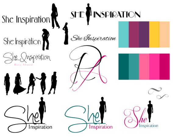
It’s back to it now though and I have started a couple of exciting projects. One is another custom website for a woman who is launching a new business as a Holistic Style Coach, She Inspiration. She is an amazing, warm and inspiring lady that I met in an Entrepreneur group. We hit it off right away and have been masterminding and supporting each other as we venture into breaking away from corporate life to start our own businesses. I’ve started working on a Moodboard of color palettes, fonts and some branding graphics for her. Below is where we are with it. For the website, I’ll be starting with the Practical Theme from Themeforest.

She Inspiration Moodboard

As you can see, I’m enjoying myself so far!

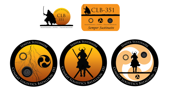
I also have started a coin design for a battalion on the military base that I work on. Definitely new territory for me but I’m having a blast. Their goals were to communicate who they are, what they do and where they are stationed. Below are a couple of samples from the drafts that I submitted. **Disclaimer: the tire graphic is a comp that I did my best with in Photoshop. If tit is approved I’ll purchase and finalize.

Military Coin Design DraftsI also have recently stumbled upon a captivating photo that my mucho-amazing photographer friend took in her travels to Hong Kong. It’s a street scene that she is calling ‘Train Tracks.’ Take a look and see which part of it draws you in. For me, it’s the man crossing the street with the black umbrella. See him?

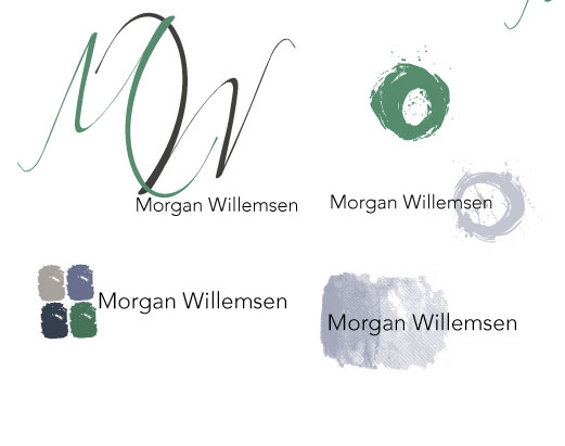
Morgan Photo Hong Kong

Train Tracks by Morgan Willemsen

Well, I hope that all of you have a wonderful weekend. The holidays have kicked off with high energy, as always. I love it—it’s contagious!

Until next time,

Jen

Custom Portfolio Website

Hi there,

MKM Design Custom Portfolio Site

Screen Capture from my latest work: a website for MKM Design.

It’s been a little while since I posted, but there’s a good reason why. I’ve been working on building a website for a fellow designer, Ms. Mikelle Morrison, independent designer at MKM Design. Mikelle is a senior graphic and web designer who specializes in User Experience and Brand Design. She’s incredibly talented and was inspiring to work for, to say the least. As with many projects, seeing this one come to an end was bitter-sweet; on the one hand, I am thrilled to see the site launch and to have my client be happy with my work. On the other hand, I’ll miss our day to day interactions and collaboration. I do know, however, that Mikelle and I will stay in touch and talk often. I’m very grateful that our paths crossed and that we were able to work together.

Also…If you happen to listen to podcasts that center around design, you can hear Mikelle on The Deeply Graphic Design Cast, a wildly popular podcast led by Wes McDowell of The Deep End design firm. I find myself relating, laughing and being inspired by the speakers and topics each time I listen. It’s great stuff!

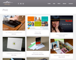
Below are screen shots of Mikelle’s homepage as well as a shot of her ‘Print’ portfolio page. The theme I started with was Wildfire from Themeforest.

Visit the Site

Homepage of Mikellemorrison.comHomepage of Mikellemorrison.comFooter of Mikellemorrison.comPrint page of Mikellemorrison.comIt’s been a great experience. I’m looking forward to many, many more. I was certainly not alone in making this project a success though. Mikelle gave amazing art direction and was a true team player. I also had an angel on my shoulder, Mrs. Lindsay Siegel Beckman of Stoke Interactive. Lindsay graduated from the same program I am currently in for my Masters Degree at Academy of Art University and has been guiding me in all areas of my career. We connected through the Alumni Association a couple of months ago and it’s been, as they say, history ever since.

Stoke Interactive

Stoke Interactive is a design firm that specializes in delivering web technology and branding solutions for socially conscious companies. Connect with them on twitter, @stoke_ntrctve, and—read more about them below…

We strongly believe that every company has an opportunity to change the world. Every small detail makes a difference, which is why we are dedicated to putting extra time and love into helping others that otherwise might not have a chance. We embrace the stories of your how your non-profit or company is bettering the world. It’s all about working together toward a common goal; a better tomorrow.

You’ll be hearing a lot more about Stoke in my upcoming posts as I start to work on projects with them. To put it bluntly…I’m STOKED. Pun intended.

Talk to you soon!

Jen

User Experience Design, Useful Web Design Tips and Color Palettes


Hi Everyone,

Well, we made it through one of the worst typhoons in history here last weekend. Recovery efforts are still underway. Luckily, we all have our electricity back—a very good thing. 🙂

Brand Insight: User Experience Design

In the past year I have been delving deeper into the field of User Experience Design. As a Brand Identity Strategist and Designer this has been a very organic progression in my professional development. I wrote a post about it a few months ago: see it here.

In this post I talk about the following topics:

  • What is Usability anyway?
  • It’s Common Sense; Design to Your Visitors’ Habits and Preferences
  • Maximize Prime Real-Estate
  • Cut the Junk
  • Always Ask the Ultimate Question

I’ve learned so much since I stepped into this continually evolving field and have implemented many of the insights that I’ve picked up. I’ve seen dramatic transformations take place for existing brands that has lead me to adopt several of the core practices of User Experience Design.

That is why I chose to revive this former post in this week’s Brand Insight. Enjoy.

Don’t Forget These Other Useful Tips

Site Planning 101

  • Research the Competition: Competitive Analysis- national, regional and local levels
  • Define Site Goals
  • Gather Content

Color Tip

For this week’s color tip, I’d like to share more about color palettes, as I did in my last blog post. This week we’ll focus on monochromatic color palettes.

Monochromatic color schemes use variations in lightness and saturation of a single color.

This creates a scheme that looks clean and elegant. Monochromatic colors fit well together as they are soothing.

Monochromatic palettes are easy on the eyes, especially when built with blues or greens. They can be used to establish an overall mood. For flexibility, the primary color can be integrated with neutral colors such as black, white, or gray. However, due to the lack of contrast, highlighting the most important elements of an artwork can be a challenge.

Tips For Use:

  1. Use tints, shades, and tones of the key color to enhance the scheme.
  2. Try the analogous scheme; it offers more nuances while retaining the simplicity and elegance of the monochromatic scheme.

Source: Color Wheel Pro

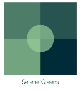
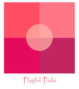
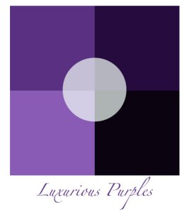
Pinterest is a great resource for exploring color palettes of all varieties. Start a board on there and then share it with your designer when you are working on your next project. Below are a few palettes that I have used in the past and that I have tucked away in my virtual briefcase.

Image of a Green Color PaletteImage of a Pink Color PaletteImage of a Purple Color Palette

Thank you so much everyone and enjoy your weekend!

Jennifer


Masterminds, Pulling Your Brand Together and Then Building Your Graphics and Visual Elements

Hi Everyone!

Well, we survived the typhoon. Scott, my hubby, got to spend time with the kids, which is so nice as he travels so much for his job. I enjoyed the family time too and also had some free time to play on my social media networks where I met some amazing entrepreneurs that I’ll definitely be staying in touch with. A few of us are going to form a Mastermind Group. I am thrilled that this opportunity arose as I love masterminds. They are extremely powerful- a quick and dirty definition of them that I came up with is: “professional and personal development support groups.” How it works is you form a small group that checks in with each other once a week, once a month or whatever works best for all of you. You share goals, challenges as well as your knowledge and experience in order to help each other start and maintain forward progress towards your goals and dreams. You are cheerleaders for each other, accountability partners, sympathetic ears and more. If any of you have ever been a part of a mastermind group, you know what I mean. If you haven’t though and I’ve piqued your curiosity, Click Here to read more about Mastermind Groups.

Brand Insight

Now, for this week, for the Brand Insight, I am continuing to write about the Brand Building Process by talking about Building Your Brand’s Visual Elements. This is the part where we design. Color palettes, fonts, logos, newsletter templates, social media banners and backgrounds…all of the elements that comprise your look and feel. The trick is that the success of these elements depends on carrying out the preliminary legwork that I have been writing about. This process really is transformational- I learned this through years of experience in carrying this process out with my own clients. An amazing designer and educator, Jennifer Bourne of Bourn Creative, uses this workflow and also offers a lot of education on it. Learn more about Ms. Bourn and her business HERE.

To recap the Preliminary Steps:

  • Make sure that you determine your Purpose. Who are you and why are you in business. You may need to backtrack a bit and explore what your passion is. Read about it HERE.
  • Who is your Target Audience? Who are you in business for? Who will benefit from what you do or what you make? Read about it HERE.
  • How will you Talk Yourself Up? You need to communicate who you are, what you do and how you are better than the rest. How do you want your target audience to perceive you? What do you want them to think when they hear your name? Read about it HERE.

That brings us to designing all of the elements that will carry out the strategizing that we have been doing. Building a strategy, executing design and building a user experience is the core of what I do. I’ve written a lot about it here on my blog and will continue to do so. So please, take a look around, contact me if you have any questions and get started on building your brand!

Keep checking back too because from here I am going to share more about Brand Definition and Development (determining your passion and purpose-that thing that you are going to build a brand for and market), the Design Process, User Experience Design and more.
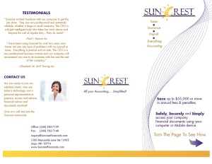
Image of a Brochure Design

Recent Brochure Design: The Core Brand Runs Through All Elements
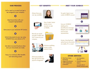
Image of a Brochure Design Inside

Recent Brochure Design: The Core Brand Runs Through All Elements

Color Top: PINK

Romance, Femininity and Youth are moods that are often struck when considering the color pink. Soft tints of pink are often very soothing and appear to be more delicate. Contrary to that, HOT pink is stimulating and is used to incite activity. I used hot pink in the menu that I designed (and which I shared in a previous post) to entice appetites and stimulate hunger for the confections that it was advertising. Conversely, I used a soft pink in a baby shower invitation that I designed. Take a look.
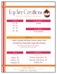
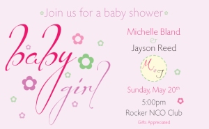
Image of a Menu Design

Image of a Baby Shower Invitation

Creative Inspiration

I am always devouring design; every kind of it—household goods, fashion, architecture. You name it, I love seeing how it is build and how it functions to make our lives better. Good design from any field inspires the brand designs that I create.

Below are photos from Design Milk, one of my favorite sources for inspirational design photos. The first is a candlelit balcony. Just looking at it makes me relax and open up my creative channels. The second is a watch that separates the hours and the minutes. It’s unique and interesting. Gets me thinking…See what these photos do for you.
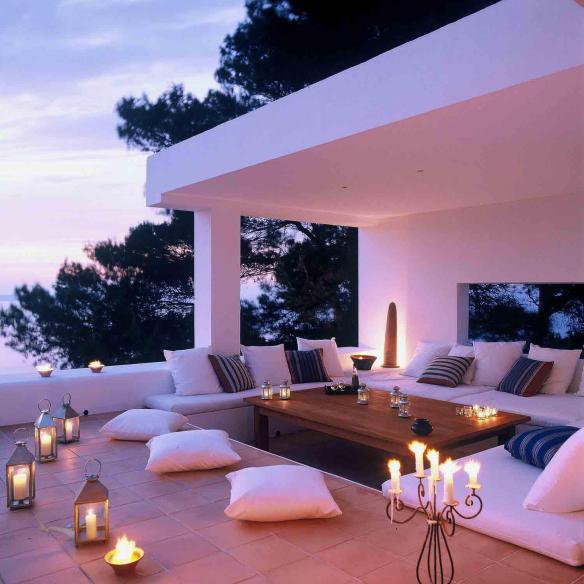
Image of a Candlelit Balcony

Image of a Split Watch

Thanks everyone! Have a great weekend. 🙂

Jennifer

Pure Designs is a creative company I launched that offers graphic design and web design services. With over eleven years of experience in Marketing and Design, I have a wealth of information and inspiration to share. I love what I do and look forward to each and every day that I can design. View my portfolio here to see a selection of my work. Please feel free to post a comment to my blog or use the contact form on my blog or website to reach me with any questions or to book a consultation. Talk soon!
Getting to Know YOU: Get Clear on Your Passions and Purpose PLUS a Color Tip and Creative Inspiration

Hi Everyone,

Before we start, check out my Media page to see a new type animation video that I recently completed as well as an interactive online brochure. Imagine the possibilities for your own business and brand!

I hope that you enjoyed reading about ePubs last week as well as all of the options and opportunities that you have to share your knowledge and promote your business with them. I also hope that you found some inspiration in the color tips and photos that were in

Image of a Brand Design

Logo and Brand Design by Jen

that post. Color and finding a look and feel that is relevant to your particular business is so important. Therefore, as you look at what I post each week in these areas, see what stands out to you in terms of designing the look of your brand. You never know when you will find just the right color or design element!

This week, I’ll continue to build on what I consider to be three main components to your brand’s design:

  • Brand Insight– Why do we spend so much time on brand development and design?
  • Color– What are its meanings and how can it apply to you?
  • Creative Inspiration– a little creative inspiration to feed your business’ brand development.

I have chosen these three areas because it’s important to know, first, who you are when you are building your brand identity, whether it is for you personally or for your business. Knowing who you are feeds your passions which it turn feeds your purpose and what you do in life. It’s a crucial first step and part of what I do is consult with clients to help them reach this clarity, should they need it. Having this insight sets us up for designing a brand for you or your business that will be successful in the long term. It really works, I’ve seen it firsthand.

Continue reading

Brand Development, Color Insight, Inspiration and eBooks: This Post Has It All!

Hi,

Disclaimer: This post is packed with fantastic content. It’s a little longer than usual so bear with me. I’m adding a couple of mini-sections that are driven to help you put all of the pieces of your brand together, at least as far as my expertise reaches. Take a look below to learn more and get started!

In this post, you’ll see:

  • Brand Development Insight
  • Color Tip of The Week
  • Purely You- Inspiration just for you!
  • Featured Article- Publishing Your Passions through eBooks, eZines and Digital Newsletters

Brand Development Insight

All of my design work helps my clients build a cohesive brand. The brand is the bigger picture that my design work is a part of. Therefore, I’d like to include a tip or two in my posts that links back to your overarching identity.

This week: Brainstorming Your Brand.Before we can get started on building the visual identity of your brand, it’s important to get clear on your Brand Positioning and Brand Promise. This is something that we can certainly do together- it actually helps me as a designer so that I can get to know you and your business thoroughly. To cut to the chase

Pure Designs Brand Piece

Pure Designs Branding Graphic

on this, ask yourself these five questions:

  1. Who Are You?
  2. What Do You Do?
  3. Who is Your Target Market?
  4. How Are You Different?
  5. What is Your Promise?

This is what I did for myself and it works wonders. It really helped me to dig deep and establish focus for my business. From here, developing my brand (selecting color, typography and graphic elements) was so much easier. So, get started with these and have your answers ready when you meet with your designer. They’ll thank you, trust me.

Continue reading